 Gero Gerke
- Published on
Drawing HealthKit workout heart rate with Swift Charts
Swift Charts is a new library by Apple that was (sidenote: Currently in beta for app developers. Users will be able to download apps using Swift Charts somewhere around fall 2022 when iOS 16 is publicly released. ) and allows developers to create rich charts in their applications while being fully accessible and performant. Sadly, this library is only available in iOS 16 and up, so you need to fall back to another charting library or a custom view on versions before iOS 16.
Loading heart rate samples from HealthKit
If you take a look at the following graph, the chart type we're using here is a bar chart, but with the variation that the bars do not all start at 0 on the y-axis. Instead, we supply two values, the min() and max() heart rate for each bar we're drawing.
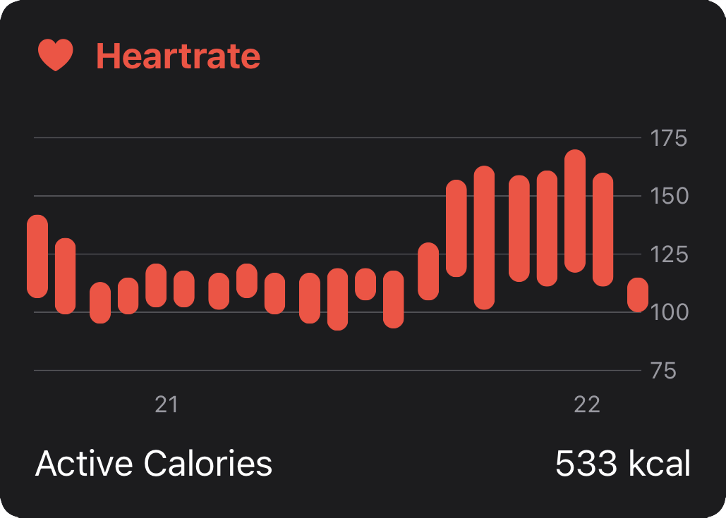
To specify the amount of bars drawn, we can simply divide the workout duration by the amount of bars ("the buckets") we want. For example, if the workout is 20 minutes long (1200 seconds), we create 20 bars with a length of 60 seconds (1 minute). If the workout is 40 minutes long each bar would include 2 minutes.
let interval = DateComponents(second: Int(workout.duration) / 20)
Next, we need a HKStatisticsCollectionQuery to load the heart rate samples from HealthKit and collect them into the form of [Date: (Double, Double)], a dictionary of Double tuple (containing min() and max() heart rate) indexed by their bucket start date.
let quantityType = HKObjectType.quantityType(
    forIdentifier: .heartRate
)!

let query = HKStatisticsCollectionQuery(
    quantityType: quantityType,
    quantitySamplePredicate: nil,
    options: [.discreteMax, .discreteMin],
    anchorDate: anchorDate,
    intervalComponents: interval
)

query.initialResultsHandler = { _, results, error in
    var weeklyData: [Date: (Double, Double)] = [:]

    results!.enumerateStatistics(
        from: workout.startDate,
        to: workout.endDate
    ) { statistics, _ in
        if let minValue = statistics.minimumQuantity() {
            if let maxValue = statistics.maximumQuantity() {
                let minHeartRate = minValue.doubleValue(
                    for: HKUnit(from: "count/min")
                )
                let maxHeartRate = maxValue.doubleValue(
                    for: HKUnit(from: "count/min")
                )

                weeklyData[statistics.startDate] = (
                    minHeartRate, maxHeartRate
                )
            }
        }
    }

    // use `weeklyData`
}
Finally, we can pass the weeklyData dictionary back into our UI to be displayed.
Displaying a Heart Rate graph
Swift Charts works declaratively and allows us to easily pass measurements to the Chart. For this, the data must be Identifiable. We're creating a simple helper struct that allows Swift Charts to make sense of the data.
struct HRSample: Identifiable {
    let id = UUID()
    let date: Date
    let min: Int
    let max: Int
}
We could also adapt our query code above to return this struct directly for each bucket, but I've emitted it here in the interest of brevity and better understanding the concept.
Finally, we can use Swift Charts for (sidenote: You should probably use if #available(iOS 16.0, *) to only render on iOS 16 and above.) . We're using the BarMark here as it allows setting the min() and max() points using yStart and yEnd. As you can already see, Swift Charts brings many initializers for its primitives and is therefore very flexible in creating all sorts of charts and configurations you might need.
import Charts

let mappedMeasurements: [HRSample] = measurements.map {
    (date, span) in let (min, max) = span
    return HRSample(date: date, min: Int(min), max: Int(max))
}
Chart(mappedMeasurements, id: \.id) {
    BarMark(
        x: .value("Time", $0.date, unit: .minute),
        yStart: .value("BPM Min", $0.min),
        yEnd: .value("BPM Max", $0.max),
        width: .fixed(10)
    )
    .clipShape(Capsule()).foregroundStyle(.red)
}
.chartXAxis {
    AxisMarks(values: .stride(by: ChartStrideBy.hour.time)) { _ in
        AxisValueLabel(
            format: .dateTime.hour(.defaultDigits(amPM: .narrow))
        )
    }
}
.chartYScale(domain: 50...190).frame(height: 150)
Then, we apply some styling such as setting the clipShape of the bar to Capsule to mimic how Apple Health charts look. To label the X axis, we can use the Date of our bucket. ChartStrideBy is a struct from the Swift-Charts-Examples project which allows us to easily pick calendar components for labeling the chart.
Finally, we limit the chart area ("domain") to be around the (sidenote: No need to guess, we could calculate it using the buckets we have.) for the workout.